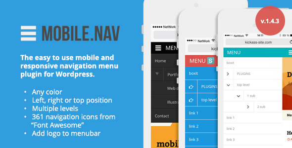

MOBILE.NAV – The easy to use mobile and responsive navigation menu plugin for Wordpress
• Easy to install
• Uses Wordpress built-in design language (you feel at home right away, no new controlpanel to learn all over again)
• Integrates with Wordpress menu system
• Supports expanding menu tree (from Wordpress menu system)
• Apply any color combination you like
• Installs under Wordpress standard «Settings» menu
• Works on iOS, Android and Windows Mobile
• Choose from +300 sublevel icons from Font Awesome
• Supports swipe gestures
• Sliding animation (menu now pushes the website away instead of floating above it) for the left & right menu
New features in version 1.4


Quick video demo: http://youtu.be/hXEcnr2RxKU

We have set up a user forum to track questions and issues easier. Please go to http://support.sd-dev.com and create a support topic and we will help as soon as possible.
Cheers, Team – Sommerseth Design

Changelog tracked from v.1.3
v 1.3.1
ADDED: ”window scroll to top” effect on menu open/close
ADDED: ability to restore the default colors to menu (admin color settings)
v.1.3.2
ADDED: swipe gestures. On “left” position/setting – swipe left on open menu to close it.
ADDED: close menu wen clicked outside of it
ADDED: in settings: the “left menu width” setting is only visible when “Menu position” is set to “left”.
v.1.3.3
ADDED: the mobilenav logo to the plugin settings panel
FIXED: enable/disable plugin checkbox not being saved
v.1.4
ADDED: possibility to have the menu on the right side
IMPROVED: new javascript sliding animation (menu now pushes the website away instead of floating above it) for the left & right menu
FIXED: some minor javascript bugs and css bugs
ADDED: More styling options (ability to disable the bottom “double border” effect)
NOTE: The menu set to “left” or “right” will add (if it doesnt exist yet) the following metatag to website hadd : <meta name=”viewport” content’=”user-scalable=no, width=device-width, maximum-scale=1, minimum-scale=1?/> If You dont want the following viewport settings on your webiste you can always stick to the top positioned menu.
ADDED: Posibility to change the “sublevels” arrow icon on parrent menu items. User can pick one of over 360 icons available at fortawesome. The icon can be set for both “opened” and closed” state
ADDED: The ability to change the menu icon symbol (on the top bar) . User can pick LEFT or RIGHT position.
v.1.4.1
FIXED: css bug : menu text to close to menu icon on top bar.
v.1.4.2
FIXED: css bug : extra margin borrom on menu list items
FIXED: Some minor css style conflicts by applying css reset to Mobile.Nav elements
ADDED: Extra option: Ability to enable the “pinch to zoom” on mobile devices. (in plugin settings panel “general”)
ADDED: Extra feature &option: Top bar logo – Its now possible to choose the image (upload or grab from media library) that will be visible on the Mobile.Nav top menu bar. The image(logo) will be placed after the “menu bar title” text (if You want to show only the image – leave the bar title field in the settings empty). NOTE: the image will be scaled to 25px in height (the width will be scaled proportionally).
ADDED: “eye candy” – the menu symbol on menu bar changes to “X” when menu is opened.
v.1.4.2.1 (current release)
FIXED: CSS for top menu bar logo positioning improved.
No comments:
Post a Comment